SUMMER PLACEMENT -
INTERNSHIP AT KCC PACKAGING
PLACEMENT OVERVIEW
My summer placement, as part of my aim to explore the packaging industry, was at KCC packaging in Eastleigh. This was an official internship that took place over five weeks at their factory and office facilities, doing everything from CAD to content creation for their Instagram account.
KCC is a sustainable food packaging company that supplies fibre-ready meal trays and other food packaging products made from sugar cane fibre. This material is 100% compostable and has a zero-carbon footprint and aims to be a solution to the excessive use of single use plastics (SUPs) by supermarket retailers.
This sustainability driven mind-set, in combination with delivering a product that can equally serve the consumer and the environment throughout its life, is what drew me to the company. I was also interested in understanding how the value of our natural resources, such as utilising the biomass of food waste (instead of going to landfill), is key in maintaining the balance for all living things.
Overall, the placement was a multidisciplinary and practically enlightening experience, where I enjoyed contributing my skills to all manner of tasks. Below is my full internship journey, from initial meeting to the last day. This has been laid out in a blog style format, with the learning, tasks, and challenges of each day summed up with relevant research and visuals. I also summarised each week with a Gantt chart, this was a visual timeline that tracked my progress and highlighted any points that could be useful for projects in the future.
References for the information and images that are not of my own design are listed in a document at the bottom of the page.
INDUCTION DAY (13/04/2021)
The ‘induction day’ and my first visit to the KCC factory was arranged after a positive zoom call and thread of communication with the KCC team. The sustainable focus behind the company’s ethos and element of product design is what encouraged me to originally pursue KCC.
After my induction day experience, this effort was undoubtedly worth it. I was given a fun tour around the factory and warehouse facilities, meeting rest of the friendly KCC staff. We also planned the structure of the internship, with a time span of five weeks and how I could contribute during this time.
The main takeaway, apart from getting a feel for the factory, was discovering the basis of ‘denesting features’. I now see how important they are in the forming of a food tray, so each product stays in optimum condition when stacked together. This is an aspect of packaging I had yet to discover and so was keen to continue my research later in the placement.
My small task on this day was drawing a few rough representations of tray product ideas for an upcoming client. These sketches are shown below. I had fun experimenting with how a tray would look with multiple sections, these were trays I had already observed being sold in supermarkets like Iceland.
Another practical aspect I carried out was exploring the types of products KCC supply, including their most common oven safe compostable food trays. These were fun to investigate to understand how they were designed.
PLACEMENT PREPARATION RESEARCH (06/05/2021)
To be prepared for the internship, I conducted some initial research into the two areas that were mentioned by head of KCC during my induction day visit. The first was inspired by my discovery and interest of ‘denest’ features.
My main takeaway of this exploration was that ‘denesting’ is a process of separating items that are nested together. A ‘denest’ feature is what enables this process to occur smoothly and allows an object to easily be released from another in a stacked formation. This also means that products can be stacked together to save space during manufacturing and transportation.
The biggest advantage of this is that it saves storage space, as a greater amount of product can be packed and therefore sold. These features are found on many everyday products (e.g., ice cream cones/plastic cups etc.), often in the form of tapered edges or indented corners that fit inside each other. It is a very important factor on even cheaper and disposable items, such as food packaging.
The second area of research was inspired by the potential of using a 3D printer to produce packaging prototypes. I have always wanted to experience using a machine myself to prototype larger items. This research into 3D printing and the CAD/CAM involved gave me a fundamental understanding of the entire process, including the materials and types of printing methods that are for set product outcomes.
The most common form of 3D printing is known as ‘Fused Depositional Modelling’ (FDM), which involves a thermoplastic material being extruded from a heated nozzle in a layered formation. There are sustainable or recyclable options for materials, such as PLA plastic, which is biodegradable, and are alternatives to the traditional ABS plastic.
Although these recycled materials are often brittle and not very structurally sound, they would suit the purpose of a visual prototype. KCC could use a 3D printer to produce and show case printed versions of potential tray designs to clients, rather than just a 2D technical drawings. This research not only made me knowledgeable within two areas of packaging and product design, but also inspired me to continue this independent research during my placement.
KCC INTERNSHIP - WEEK ONE
01/06/2021
My first task was editing several CAD technical drawing sheets to move the positioning of KCC’s branding within the title block. This made the CAD design easier to interpret, which was important because the CAD and production of the trays is carried out overseas. Any miscommunication of design specifications can potentially waste valuable time and therefore money.
The main task of the day came from a new client request for a compostable tray design that would hold eighteen sausages. The client’s emphasis was that this tray needed a unique ‘shelf’ feature that would mean two rows of nine sausages could equally be presented and visible whilst still in the packet.
I created a series of initial design sketches based on this request, alongside some quick visual research into tray designs sold by big brand retailers like Tesco’s and Sainsbury’s. I studied a tray up close, thanks to a member of KCC purchasing a pack of sausages from Aldi. This revealed that most supermarkets have a black or clear tray that holds nine sausages, with gapping at the top and bottom of the tray.
Luckily, the client gave us clear specifications for the dimensions of the tray, with focus on avoiding any gapping as seen in existing trays. This extra space could be utilised to add more product in the tray, or instead decrease the trays size to allow more to be packed together for distribution and save valuable funds.
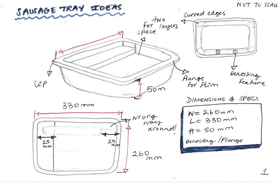
Despite this being an initial sketch, I managed to successfully visualise how the ‘shelf’ could hold all the product and equally leave enough space to show each individual sausage. The only unknowns at this point were the size of the flange and whether the client wanted a film seal, meaning this would need to be wider than usual trays. These two sketches were sent to the client for feedback.
Other tasks I carried out on this day involved setting up my own KCC email name and signature template. I really enjoyed the opportunity to personalise and add my occupation – ‘Intern Design Engineer’. Adding a face to any form of communication makes a request more personal, so I will consider doing this for my own design email in the future.

02/06/2021
The main tasks on the second day of my internship involved the layout design for an official KCC presentation and further improvements to the specifications of the sausage tray design.
This presentation was to be distributed to important clients and my role was to refine the important information required inside the document into a written script. I also created the branding and visual theme for the presentation design, following the colour scheme used on the KCC website.
For this, I was introduced to the marketing manager of KCC and discussed the protocols of using images/logos. All the branding material, including the exact shade of green from the KCC logo, was easily accessed via Microsoft SharePoint. This meant achieving a clean and professional aesthetic for the presentation was a non-difficult process.
On the other hand, condensing the verbal content required in the presentation was very hard and took numerous attempts. This was critical to ensuring the delivery of the information was concise and in easily digestible parts.
The client who requested a ‘shelf’ sausage tray design responded positively to my initial sketches of their idea. The only issue that needed to be reconsidered was to decrease the size of the tray further to avoid any gapping, which also meant scrapping the original ‘shelf’ idea. The solution consisted of a smaller tray that would hold half the amount of product, with an angled edge (like a skillet) so it would be positioned up right in the supermarket.
The sausages would stand out more against other products on the shelf, and more likely attract the eye of busy customers. This angled edge was also for practical purposes, as a tapered edge is needed for the fibre material to successfully flow into the mould to form correctly during manufacturing.

03/06/2021
The work on the all-important KCC presentation was continued on this day, with the first version of verbal script finished and ready for feedback. The main task and something I continued to do throughout my internship, was make content for the KCC social media Instagram account. This averaged at three posts a week, which meant I could easily create the descriptions and accompanying photos over three days.
https://www.instagram.com/kccpackaging/
The first content to make was themed around ‘International Turtle Day’ and ‘World Environment Day. These posts aimed to be educative but also act as a fun way to share knowledge that related to helping the planet and environment. These kinds of topics were the main subject of KCC’s posts, which meant each one required some quick research to inform the contents of the description.
This aspect of the content creation process was highly informative, especially when I could relate the post to the theme of sustainability and KCC’s fibre material called ‘riji’. I decided to also add a helpful link or tag a relevant Instagram page with more information on the post subject, along with hashtags to attract external traffic from KCC’s current followers.
Whilst searching for ideas on the visuals for the ‘Turtle Day and World Environment Day’ posts, I discovered a free stock image website called ‘Stocksnap.oi’. This web page had a lovely series of free images that were perfect for making high quality and captivating posts. These images were finalised in Photoshop, either by adding branding or some form of graphics to highlight the key points in the description.
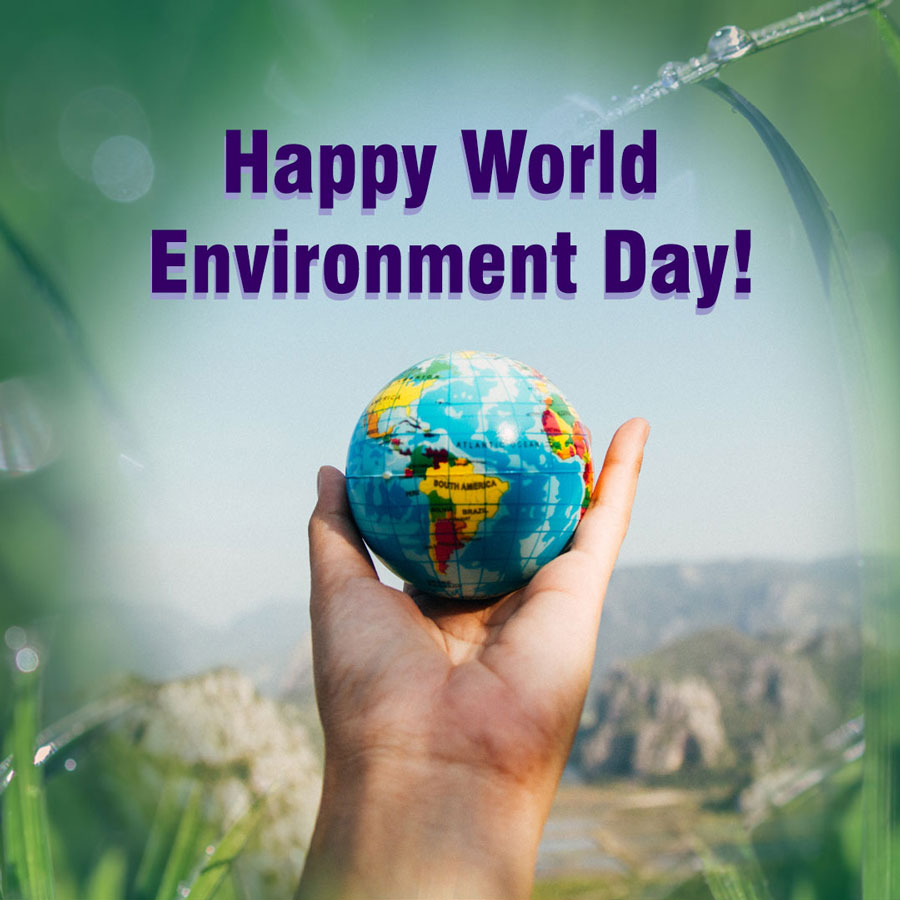
The other content I made covered the ‘Three R’s’ – Reduce, Reuse, Recycle – with emphasis on the ‘Reuse’ by showing how a riji sauce pot can be utilised in a different way. My example was as storage for my breakfast toppings, these fitted perfectly inside the pots and made for a lovely composition to photograph. I really enjoyed this task and the opportunity to inject my creative flair into KCC, along with improving my skills in planning, photography and editing software.
WEEK ONE REFLECTION
Overall, my first week at KCC was very fun and I experienced minimal challenges! The most memorable and surprising moment was having my sketches sent to a real client. This furthered my opinion on the value of basic pencil sketches and the extent to which they effortlessly convey an idea. It also helped to boost my belief in my own abilities as a student and a creative.
WEEK TWO

07/06/2021
The second week of the internship started off with a lengthy feedback session with the head of KCC on my progress with the official KCC presentation. The main area for improvement was the amount of text on each slide and how this needed to be condensed further. This was to make sure that the document conveyed the message the head of KCC wanted to send to prospective clients.
Apart from the presentation, I also created an Instagram post themed around ‘LGBTQ+’ and ‘Pride Month’. The research for this was very eye-opening, despite being very aware and supportive of this community, I did not know the origins and history of Pride Month. The visual for this was inspired by the example that other brands follow during Pride Month and incorporated the LGBTQ+ flag into the KCC logo.
I created the flag using the shapes tool in Adobe Photoshop, making sure the colours for each ‘group’ were represented correctly. The only tricky part was using the ‘inverse selection’ tool to cut out the KCC and riji logos into this flag motif to result with the coloured silhouette. This looked very clean and fitting to celebrate such a renowned event!

08/06/2021
The most important task of the day was making improvements to the KCC presentation. These were last minute changes ready for the final critique, as the document was due to be sent out at the end of the week. Although this became rather repetitive and challenging, I always think it is nessasery to thoroughly proofread work because errors are more likely to be noticed. These small changes often make a difference in the end.
Another practical activity was observing how KCC’s packaging samples are selected and sent out to customers. This gives customers a physical example of the product they wish to use for their own means, e.g., supermarket frozen microwave or hot air line meals. The sampling process was simple, the only part that required considerable time and attention was checking each individual tray for any imperfections or cracks in the material coating.
The image above shows the visual content made on the theme of ‘World Ocean Day’. The aim of this post was to explain the importance of our oceans and the plethora of resources it provides for our biosphere! It also mentioned how single use plastics (SUPs) and other plastic rubbish is polluting our oceans and can take up to 1000 years to fully break down, releasing harmful chemicals in the process.
This description also offered space to mention KCC’s riji natural fibre container products. These can be recycled (composted) into fertilizer which benefits the environment. To further the traffic to this content I promoted KCC Packaging on my own design Instagram account.

09/06/2021
Apart from testing my skills in product, concept, and CAD design, I also was given several tasks that were based on basic workplace etiquette. This included processes that I had yet to experience, such as answering the office phone or checking the specifications of new trays imported from the overseas manufacturer.
On this day I was given a walk through of KCC’s protocol for answering phone calls and the key questions to ask the caller. These were ‘Who is calling?’, ‘Where are you based/from?’, ‘What is your name, email and contact number? , and ‘How did you find out about KCC?’. Although simple questions, this is the easiest way to quickly gather information on a customer and save time in the future for discussing opportunities that could benefit a business.
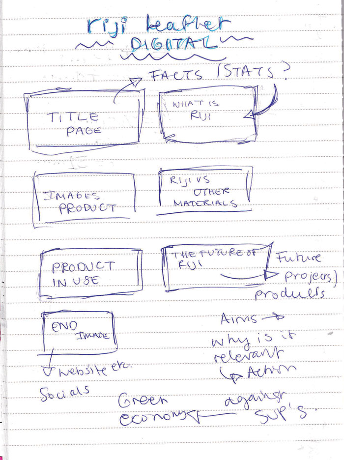
The new and important objective for the day was to begin thinking about the creation of a digital booklet about KCC’s riji material, with focus on their ready-meal trays. The head of KCC wanted to visualise riji in a fun, but educative way with engaging photographs and illustrations.
To begin this task, I sketched out my initial ideas (see above), based on the layout of digital branded PDF booklets I had previously seen. The typical layout included a combination of factual pages, explaining the ‘what, where, how, and why’, and product placement pages that included an image of product in use or on display.
To further my ideation of this riji booklet, I carried out some research into existing digital brochures, and noticed how the artistic and verbal structure were equally balanced. It also helped to gather a selection of KCC’s collateral media and past design work to get an idea of their branding ‘guidelines’. I would need to follow these for this booklet to match with the rest of the company’s aesthetic.
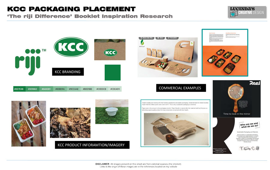
During this research, I discovered a booklet by ‘Reel Brands’ who supply sustainable alternatives to packaging. The layout of their official brochure was perfectly concise, with a clear theme throughout and high-quality images and bannered headings to set the scene of each page. I particularly liked the idea of having a cover page, despite this not being a physical book. This is what encourages people to read a book in the first place.
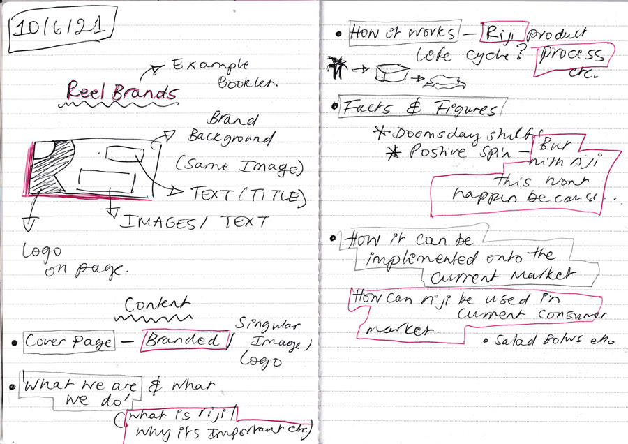
Fueled with inspiration from my research, I developed my original idea further and combined the good aspects from the ‘Reel Brands’ booklet. This is shown in the sketch below, with each square representing a page and cohesive KCC green banner.
I was particularly looking forward to the opportunity of photographing a riji tray in ‘action’, such as in an oven or being held. I think that showing any product in use is the best way to captivate a viewer into understanding how it truly works. This sketch was a perfect blueprint to follow for bringing my design into a digital format.

10/06/2021
The only tasks carried out on this day was a quick feedback session on my sketched ideas for the riji booklet, this was well received and meant that next week I could proceed to the next stage. The more crucial objective was to make minor changes to the branding on the KCC presentation, changing the size of the logo and double checking for any grammatical errors.
Luckily as a team with the head of KCC, we managed to complete this objective and had it sent out to the expecting parties before the deadline at the end of the day.
WEEK TWO REFLECTION
At the end of week two I had experienced the first real challenges at my internship. These related to condensing and refining the written content for the KCC presentation and the riji booklet. For the presentation, this was especially hard with numerous corrections needed at the last minute. These were noticed by the office secretary, who pointed out inconsistencies in the writing style of the presentation.
The riji booklet was not as difficult because as the information to be laid out had yet to be formulated. Although, this did make it harder to figure out whether to take a narrative or factual based approach. Despite these issues, I enjoyed learning how to tackle a task that required both visual and verbal content on a professional level. I now understand the critical role that repetitive critique can play in the success of academic presentations.
I also had fun incorporating the LGBTQ+ theme into the KCC branding, where I learnt a new tool on Adobe Photoshop called ‘select inverse’. This will be handy to utilise in my own design work in the future.
WEEK THREE

14/06/2021
The Instagram content for this week began with a video post on ‘Denesting’. This was a collaborative effort between me and another member of the KCC team, that involved a boomerang video that illustrated the stacking pattern of a series of riji trays. My job was to create the verbal content for the description, which was an easy task because of my previous research on denest features at the start of the internship.
During my time with KCC, I also had the opportunity to carry out independent activities. Today’s discussion of recycling contamination and the advantages of compostable packaging, lead me to discover the impact that food waste being sent to land fill is having on our environment. I saved several of these research materials as potential points of reference for the topic my future dissertation, as the discovery of this issue opened my eyes to the endless learning the packaging industry has to offer.
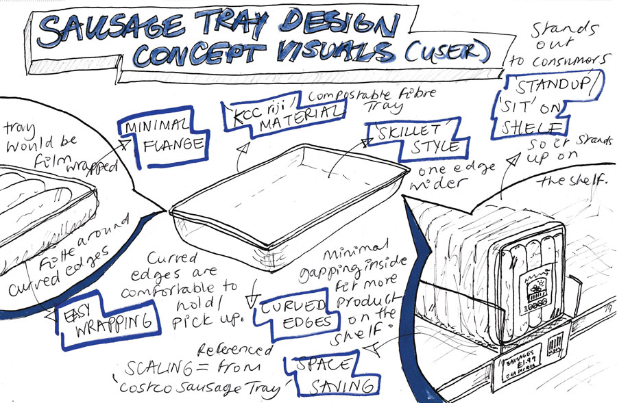
Another independent task I started on this day was inspired by my previous work on a sausage tray design. There was no further communication with the client after the sketches were updated. Despite this, I liked the unique ‘skillet’ tray concept so much, I thought it would be a waste not to progress it into a basic CAD mock-up. This would be good practice for my physical and digital design skills, as well as be the all-important CAD practice needed for my design specialism.
The sketch above shows consideration for the user functionality of the tray design. It identifies several features that would make the product both user friendly and functional as a vessel to hold sausages. This includes the minimal flange around the tray so that it can be easily film sealed during manufacturing, filleted edges to make it comfortable to handle in the supermarket, and the angled face so the main body sits up right on the shelf.
The reference for the scaling of tray is drawn from two already well used products, these are a sausage tray from Costco and an Aldi sausage tray from my primary research.
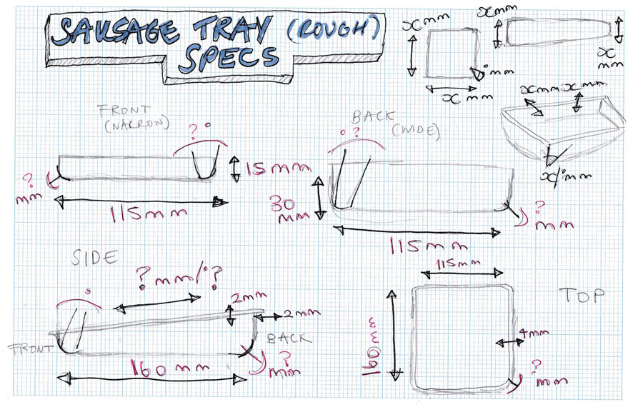
The second sketch illustrates a series of rough dimensions for the tray, this will be very handy for when I attempt to recreate the ‘skillet’ in CAD. Although I did not have all the specifications, such as the angle of the corners or front face, the basic length/height/width measurements helped me guess the composition of each side. These sketches were interesting to develop using my own intuition and past technique of taking a basic product idea into a digital concept.

15/06/2021
The theme for the Instagram post on this day was based on St John Ambulance’s recent update to the CPR protocol. This was to raise awareness of how to carry out the process in a COVID-19 safe manner, where the mouth if the casualty is covered and only chest compressions are administered before the emergency services arrive. I found this interesting to make as I had not considered how this would need to be followed to prevent the transfer of potentially harmful pathogens.
I also continued work on the riji digital booklet and began the process of laying out the basic skeleton of each page. The head of KCC wanted me to focus on creating a collection of illustrations and photographs to add into the booklet, before concentrating my attention on the written content.
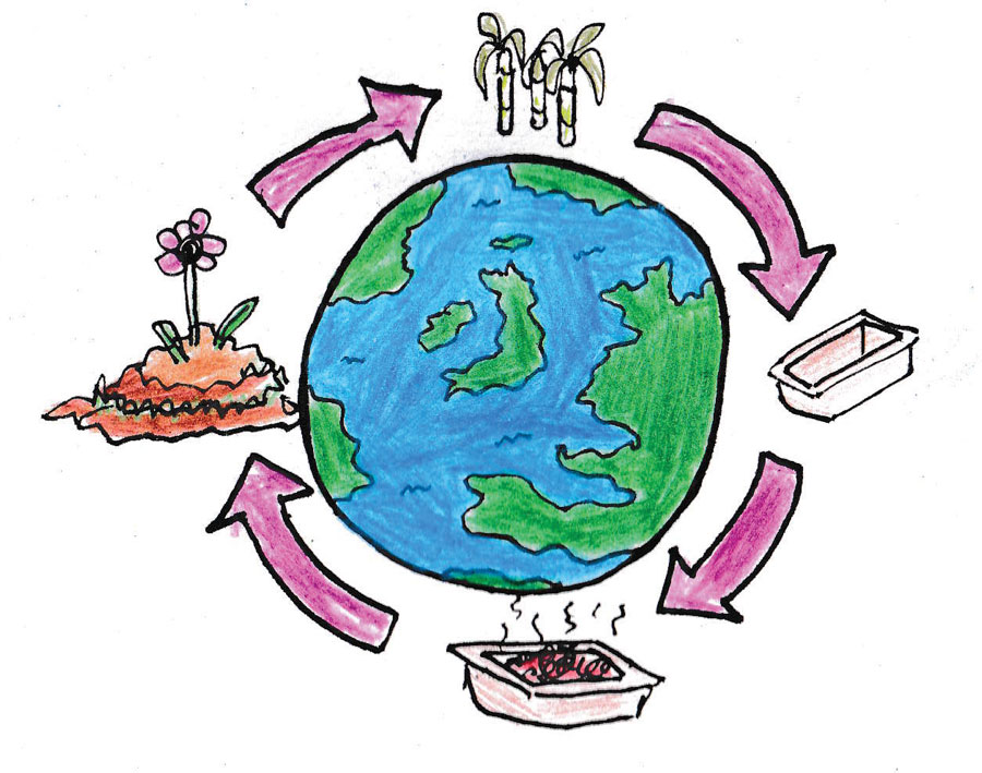
A few examples of my initial pieces are shown below, including a diagram that represents the how riji supports the circular economy and a test image of a product shot for the riji tray.

16/06/2021
This day was spent on my independent task to mock-up the ‘skillet’ sausage tray in CAD. I wanted to produce a 2D representation of each view, as in my original pencil sketch. My software of choice was AutoDesk AutoCAD, which I used in my first year of university and felt it was the correct tool to use for CAD work for the rest of the internship.
Using my rough dimensions sketch as a visual guide, this exercise was pleasant to carry out and gave me a good refresher of some of AutoCAD’s basic tools and commands. I also had the opportunity to use my title block sheets, with view ports and scaled dimensions to give the final sheets a professional appearance.
The hardest part to model using the line tool was the tray lip and flange, as I did not fully understand the limitations of the fillet tool and how it can only work on geometry of a certain length. However, once I had drawn out the front view of the tray, I was able to work out the extra tolerance required and the full width of the flange (4mm) to apply the correct fillet to the rest of the model.
To see the finished AUTOCAD drawing in better quality (the jpeg is just for visual reference) click the button below!
To see the finished AUTOCAD drawing in better quality (the jpeg is just for visual reference) click the button below!
See the build process in the video below.

17/06/2021
For this days Instagram content, I was set a mini-research activity into the meaning behind ‘Recycle Awareness Week’. From this I discovered that this is an annual event is designed to encourage people to recycle more smartly and consider how something can be re-purposed for another use. The visual I made for this was a mixed-media piece that involved a sketch and a free stock image from StockSnap.io, combined in an interesting border composition.
This day also involved a venture into a concept product design and CAD exercise, like my previous task on a sausage tray idea. This time a new client wanted a riji fibre salad bowl, similar to others on the market, but with a denest feature. To start my creative process, I carried out some reference research into these bowls mentioned by the client and others in the sustainable packaging scene. Most of these bowls had a rounded base, as this was more practical to hold, with a single denest raised in the centre.
I also carried out some primary research later on in the internship for the head of KCC, where I investigated the bowls sold in Café Nero and Pret A Manger. I really enjoyed this activity as I was able to practically engage with the product and understand its place within the shop environment.
This research and inspiration was of great help for sketching out some visual examples of the client’s request. The sketches below show two bowl designs with slight variations to the steepness of the bowl shape and positioning of the denest features.
I had basic information on the scaling of this product as it was a fairly new design, and most existing salad bowls were shallower than the idea requested. Even with pencil sketches, these drawings would be tricky to digitally recreate in CAD with such little information, especially in working out sizes of the bowls flange and desired shape for the base denests.
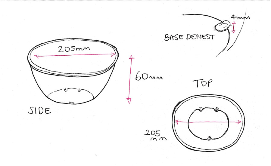
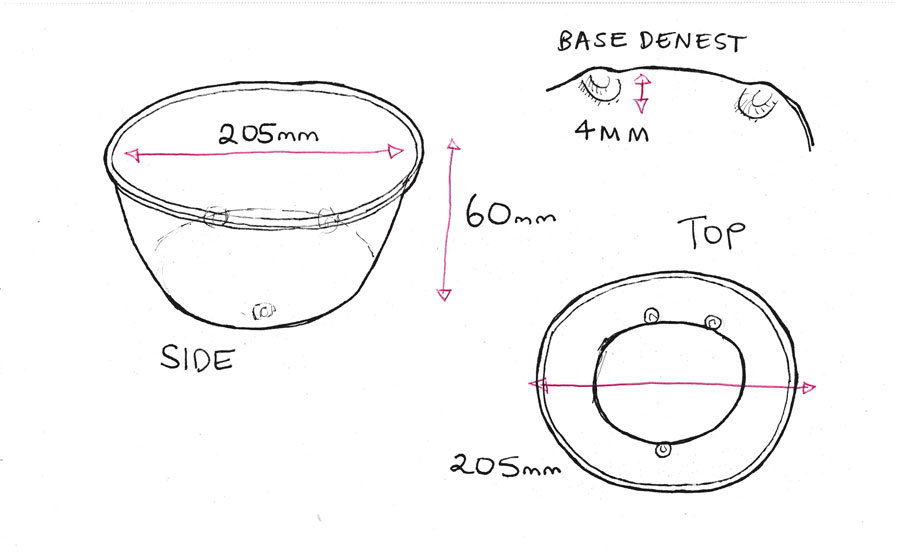
Regardless of this uncertainty I still tackled the next step of my process, the user functionality and specification sketches. The user visual is shown below, with each design feature highlighted to indicate how it would benefit the overall function of the bowl. This includes the denests, with three spaced out and raised slightly around the edges of the base.
I also added other aspects that would increase the product’s usability, these would be an indent inside the bowl near the top edge to indicate a fill line, as well as an overhanging flange to make it suitable for film sealing or a clip-on lid.
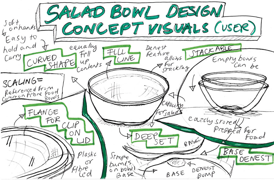
The rough specification sketches cover the basic measurements for the bowl. These limited numbers were provided by the client because only the size of the bowl needed to be visualised. Although, I still referenced an average scale for the height of the denest bumps from my original sketch. This was based on the design in popular salad takeaway bowls and would be helpful for drawing them in CAD.
Now more familiar with AutoCAD, I could crack straight on with the CAD sketches of the bowl. This was represented in 2D with a top, bottom, and side perspective views. The full process, from the first line to the final models, can be viewed in the step-by-step videos below. The summary of this design journey is that the outcome was one successful bowl design, with a top, side and bottom view of a concept that fulfilled the needs of the client.
I was pleased with how effective the drawings looked, especially with the representation of the denest features at the edges of the base. I also attempted to design the bowl with a slightly different base relief shape, this is labelled as ‘DESIGN 2’ on the technical drawings sheet. However, after closer inspection this shape would be highly impractical in real life. Therefore, my first design ‘DESIGN 1’ is the clear winner and proves that experimentation with relief angles is not practical with the precision of digital drawing.
To see the finished AUTOCAD drawing in better quality (the jpeg is just for visual reference) click the button below!
To see the finished AUTOCAD drawing in better quality (the jpeg is just for visual reference) click the button below!
The first video shows a quick snap-shot at the start of the drawing process, where I used the circle tool to lay out the diameter in the top view.
This second video captures the beginnings of the denest features.
The third video reveals the point where I modelled the side view of ‘DESIGN 1’, which is the successful outcome and bowl shape with a radius of 118mm.
The fourth and final video shows the bottom perspective of the bowl, along with the creation of the poorly and unpractically designed bowl shape of ‘DESIGN 2’.
WEEK THREE REFLECTION
The course for this week’s tasks was initially hampered when I was notified by my NHS app to self-isolate for seven days from the 17th of June. This was by far one of the main personal and practical challenges of the week, being concerned that my ability to work effectively would be impacted.
However, judging by the quality of work I produced this week, the exact opposite occurred. I was determined not to let this small hurdle dampen my motivation. This was helped by the miracles of modern technology, with zoom and WhatsApp being the tools that maintained the strength of my communication to the KCC team. It made me feel like I was still a part of the experience despite it being away from the office environment.
The work produced this week also revealed various subjects to explore beyond my internship. For example, my learning on recycling contamination proved that there is more to the packaging industry than just CAD and product design. I am now more aware of the numerous social, environmental, and political issues that come with the production and disposal of packaging products.
WEEK FOUR

21/06/2021
The main task on this day was to create the visual and verbal content for two Instagram posts. The first themed around the environmental benefits of ‘A Circular Economy’ and the other based on the importance of compostable packaging in ‘The Food Waste Stream’. Both posts required research to create each description, as I had never known of these topics in detail until now.
The general takeaway from this was that a circular approach to anything involves the end or ‘waste’ products being re-purposed for something else. An example of this being how KCC’s fibre material can be recycled into compost at the end of life and be used for biofuel or as fertilizer for soil.
This concept lead perfectly onto my learning in ‘Food Waste Streams’. Currently, most packaging covered in food waste (depending on local facilities) is rejected at recycle points and is diverted to landfill. This food then degrades and, in the process, can release harmful gasses (methane) that are 25 times more harmful than carbon dioxide! However, if made from organic materials, like riji, these containers are recyclable when contaminated with food waste.
For the ‘Circular Economy’ visual, I gave my sketch designed for ‘The riji Difference’ booklet new life, by combining it with a photograph of compost. This composition with the KCC logo in the centre and an accompanying product image looked very effective. The ‘Food Waste Stream’ visual was equally fun to make, by positioning the typography at a perfect angle so it appeared as if it was printed on the bin lid in real life.

22/06/2021
On this day, I was set the challenge to present a series of informal notes made by the manufacturing engineers in an editable spreadsheet. These notes covered the issues and problems with the machinery experienced by the team during its construction and testing.
This spreadsheet was needed to formally list these notes so they can be easily read and addressed for the better of the company as it progresses to a fully functioning production line. I started this important task by typing out these notes to check for any repeats, ready to be organised into a excel spreadsheet.
During this time, I also was requested by the salad bowl client to make some changes to the dimensions and size of the title block sheet. This was for visual purposes and to illustrate to the client how the idea progressed from my original pencil concept sketch. To see the changed version of the original AUTOCAD drawing in better quality (the jpeg is just for visual reference) click the button below!
At the end of this day, I also used my independent time to take the first set of product placement photographs for ‘The riji Difference’ booklet. This was a fun photo shoot that showed the process, from oven to serving, of how a riji tray can be used for baking. Despite these images not being used in the final version of the booklet, I think that they are still a series of well-considered and edited images.
23/06/2021
Following on from yesterday’s challenge of presenting KCC’s manufacturing notes, I managed to complete the task. The result was a labelled excel sheet with each issue listed with accompanying sections, such as ‘date’ or ‘actions required’ etc., to be edited when addressed in future meetings.
This model will be a handy tool to be used by the team in further manufacturing and production processes. I also added a severity column (ranked out of five) that will make this even easier, as it will highlight the issues that are the most important and identify problems that could result in more problems if not rectified first.
The second activity on this day involved a meeting with the head of KCC to receive feedback on my progress with ‘The riji Difference’ booklet so far. For visual reference, I screen-shotted each page on the software ‘Microsoft Publisher’ (preferred by the head of KCC for the document) to illustrate the development of the booklet at the end of my internship.
Overall, the response was mostly positive, considering it was the basic outline of the book. I personally wanted lots of critique as I feel that this is how the best version of a product is achieved and how the most beneficial learning experience is gained.
For the title page (see above), the background and banner imagery hit the mark for matching KCC’s branding seen on their website and other collateral media. The only changes suggested were to change the heading green to match the riji logo and increase the colour intensity of the rest of the composition. It was also mentioned that the rice tray image should be changed to another wet food tray that would contrast with the brown tones on the page, such as a curry with orange sauce.
The first page aimed to answer the classic what, where, when, how and why of everything related to riji as a material. The emphasis was to describe it as a container because this is the product that KCC is mostly known for.
The adjustments were mainly needed in the appearance and structure to the wording on the page, including no capitals for subheadings and correct use of terminology for specifying the riji material. It was only the top left sketch that needed to be edited so the colours were brighter.
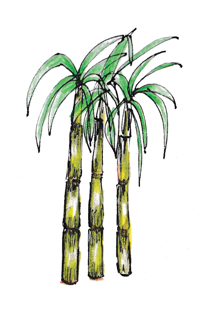
The solo product page (see above) and third pages only needed minor changes. For page two, there was rewording required for each annotation, and for three it was suggested that the brown diagram should be green to make it more eye catching. The illustration of the sugar cane in the banner was also pointed out as too ‘dull’ and needed a dash of colour. See this below.
It was still a work-in-progress for the fourth page of the booklet, as I had a vision to add a few images from my cake photoshoot once these had been fully edited on Adobe Photoshop. Although after showcasing the results of this baking venture, the head of KCC felt I could improve them even further. There was a lack of lighting and clear contrast in these images (like the cover photo), which is key in achieving the ‘commercial’ quality of photography seen in supermarket food magazines.
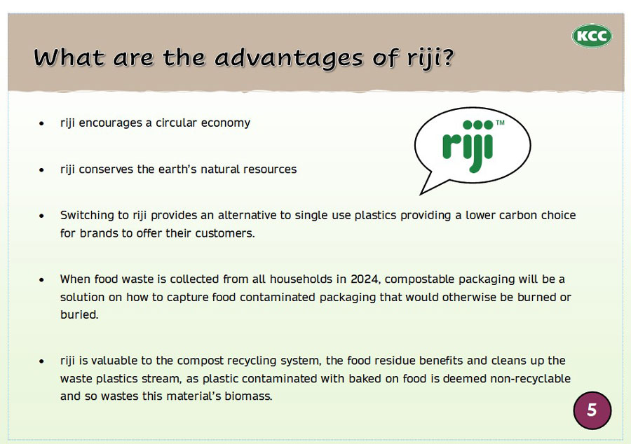
The fifth page was the most important in the entire book, as the idea of presenting the ‘advantages’ of riji to readers is what inspired the idea behind a digital booklet. The bullet point layout was a good start to the page, despite the structure of the sentences being too vague.
It was suggested that these should be laid out with a ‘fact’ about riji that is backed up by its benefit, because mentioning the benefits of something is guaranteed to maintain the viewer’s interest. The last page was well received, with no improvements needed at that point in time.

24/06/2021
In response to the feedback on ‘The riji Difference’ booklet, I carried out some additional research. This explored the layout and basic structure of digital booklets made by existing packaging companies.
During this search I came across the amazing booklet by ‘Bidfoods’, which entailed the various packaging products they offer and covered the properties of each material. Their design approach for the booklet, using organically inspired colours and well-lit product images, was highly inspiring for my own work.
With this high-quality reference, I considered the actions required to meet the head of KCC’s desired improvements. Three main objectives were to carry out more photography sessions of the riji tray in use, enhance the current illustrations so they are more ‘colourful’ and ask for help from the team secretary to work through the wording in the booklet.
I started this process by editing some of my drawings already in the document, including some designed for KCC’s Instagram posts. These enhancements were done by hand, using colouring pencils, and digitally in Adobe Photoshop with the contrast and lighting tools. This minor effort made a surprising difference to my drawings, and I was very pleased with the overall results.

The other task of the day was to create Instagram content around the theme of ‘Topsoil’. I am now more aware of the difference between topsoil and compost, but also how they are vital for maintaining all life on earth. In summary, topsoil is the top layer of land that is formed over time and is therefore made up of lots of organic matter that serves as nutrients to make plants grow.
Compost is often confused with topsoil but is instead produced over several weeks and can only be made certain conditions (e.g., dark/damp).The end result of composting is an enriching fertilizer material that can be used to enhance the properties of topsoil. Therefore, together they make for the ideal soil structure.
The visual (see below) for the post was a simple but detailed pencil drawing, illustrating how the recycling of organic materials into compost is vital for the growth of future ecosystems.
WEEK FOUR REFLECTION
The process of condensing and rewriting the manufacturing line notes required an extensive amount of concentration and time. I wanted to make sure all the information was covered correctly, as this could be economically and functionally vital for the future efficiency of KCC’s container coating process. Despite this hard work, I still enjoyed grind and liked the shift to more admin-based tasks from practical and creative activities.
Introducing photography and baking into the workings behind ‘The riji Difference’ booklet was a fun way of enhancing my learning experience. This combination of media, sketching and digital editing is key to a unique design outcome in any area of digital media.
The process of receiving feedback and then following it up with extra research reminded me of the importance of keeping up to date with the current trends in design. This practice will broaden my current and future knowledge on a subject and reveal certain ideas to benefit my own thought processes.
WEEK FIVE

28/06/2021
Prior to my final week at KCC, I carried out a second product placement photoshoot to follow up on the improvements for ‘The riji Difference’ booklet. This involved making another ‘riji cake', but with extra consideration of the lighting and composition of each scene. The outcome of this was a series of photographs that illustrated a clear baking process, from oven to plate. My positive impression of these images was shared by the head of KCC, who was impressed by the consideration and focus on the subject.
On the other hand, my efforts to produce a new food tray image for the front cover was not as successful (see images below). Despite having a good quality camera, food, especially when made up of wet or lumpy ingredients, is very hard to photograph.
The result, as with my attempts at capturing a chicken curry with rice, is often that the food appears unappetising and therefore detracts from the rest of the image. This is not the impression you want to make before the viewer has even began to read the booklet.
The long deadline for the completion of ‘The riji Difference’ booklet meant this was not an urgent project at the time, and so I was happy to continue to experiment with new photographs beyond my internship to achieve an image to the standard expected by the head of KCC.
For the rest of the booklet, there were minor changes to the text and imagery, but the main content was presented ready to be utilised by KCC in the future. The second version of the booklet is shown in the screen shots below, I plan to create a final PDF (see 30th June) when all changes and improvements have been made.
The image above captures the front cover with the changed food photograph at the top. I agreed with the feedback that it appeared to not match the quality of the rest of the page. The first and second pages also needed slight changes to the wording of certain sentences.
The cold and hot icons on page two should have been coloured to match their meaning (blue and red), this will simplify the meaning of each annotation even more.
There was no improvements needed for pages three and four, these were by far the strongest sections of the booklet. In fact, the only issue with these pages and the rest of the booklet, was the different banner image used to the one on the front and back covers. The head of KCC suggested the design would appear even more consistent if the banners in the main body also matched these pages. I thought this was an excellent idea and would match the ‘organic’ theme of riji.
The improvements to the advantages list on page five were clearly laid out with a fact and benefit structure. There was even room to elaborate on these riji facts, as suggested by the head of KCC to add greater narrative to the page. A request to remove the statistics on page one means a reference page (6) was no longer relevant. This was a sensible move as it made the reading order of the booklet more logical.
For the final page, there was discussion of changing the wording of - ‘how could riji help you reduce your carbon footprint’ - to something different. Despite liking this myself, this would be changed by the head of KCC when the booklet was due to be finalised. The team wanted a phrase that involved the idea that if producers choose riji, they can serve their customers with a new environmentally friendly food packaging alternative.

29/06/2021
The last Instagram content I made for KCC related to identifying the differences between ‘compostable and biodegradable’. Prior to the internship, I had not known they were both two very different processes. In basic terms, if something is biodegradable, it cannot be compostable.
This is because anything, either man made (e.g., plastics) or naturally occurring (e.g., vegetable peels), can break down over a varied time span. The process can result in the release of harmful chemicals/gases and leave a metal residue in the ground. Whereas items that can be composted or are compostable can break down in less time (in the correct conditions) and create a nutrient rich compound that can be used as a fertilizer. This is another reason why compostable packaging is a better choice for our planet and soils.
The visual for this post was surprisingly more challenging to produce than sourcing the facts for the description. This was due to a request to create a cool transparency effect that combined an image of compost with typography. It took me numerous attempts to achieve a perfect balance between the two elements of the composition. The eye-catching and professional appearance of outcome made the challenge worth it, and I learnt how to better use Adobe Photoshop’s layer tools in the process.
Another activity I carried out on this day was learning about denest features on circular objects. After discussion with the head of KCC on their idea to create a hummus pot, I discovered that denests on circular based products need to be oddly spaced out for them to work. This makes the stacking pattern random and decreases the likelihood that a denest bump will fit into itself when on top of the same product.
This enables items to be easily lifted by hand, rather than nesting tightly together. If this occurs the friction could cause damage to the item during transport or in the attempt to separate it from the one below.
This exploration also inspired the creation of a mini mood board (see above) for future reference in an industry packaging design principle. I found a selection of images that showed a denest feature on a series of commercially sold compostable pots and recyclable plastic cups.
30/06/2021
The last day was a fun opportunity to enjoy my remaining time at the factory. The most notable event was a final meeting with the head of KCC to conclude my internship. We discussed the potential for me to come back at some point near the end of the year.
Below are the additional images I took for ‘The riji Difference’ booklet. There is also access to my final version (as of the time I left KCC) of the booklet through the button below. This was successfully handed over to the head of KCC to use in the future promotion of the amazing riji!
WEEK FIVE REFLECTION
Although not as action packed as the previous weeks, this week was a great opportunity to discover more information about denests and conclude my internship with a positive meeting. I now know a considerable amount about a wide range of subjects within packaging, and so could potentially apply this to my next industry related venture.
SUMMER PLACEMENT CONCLUSION
Overall, my summer placement at KCC was an amazing insight into the packaging industry. It was a was highly engaging experience, from being in a factory and office environment to applying my own technical CAD and creative skills into day-to-day tasks.
The environmental drive behind the business is an approach to packaging that I have interest in pursuing myself, so this internship was an educative but fun opportunity to see how this will shape the future direction of the industry. I enjoyed observing how teamwork and communication are equally as critical in an office environment, as my university assignment project groups. Over the five weeks I believe my design practice skills and personal confidence levels have considerably improved.
The variation of activities meant I could equally challenge my current CAD practice, by designing something from scratch, along with my academic independence, after having the responsibly of laying out official documents. Next time, I would want to spend more time learning about the history and time line of the business, to understand the more technical parts of KCC. This includes the manufacturing and production of their products, or even the science behind the coating applied to the trays and how this is made food safe.
Regarding CAD, the time length of the internship and the availability of machinery also limited the opportunity for me to access a 3D printer. However, my exploration into the principles of the subject via research still offered some benefit. Also, during my final meeting with the head of KCC, there was discussion of this occurring and more if I were to visit again towards the end of the year.
The other outcome of the placement is a lasting client contact and friendships that will last beyond my placement, with mention of potential employment after university.
